


When I’m working on something like the front-end design of the game – something that doesn’t require I sit hunched over my laptop with my head clutched in my hands, muttering, ‘Why? Why?’, or gently weeping – I like to put on some TV as background noise.
Lately, I’ve been watching/gently weeping to a lot of Sean Plott’s Mostly Walking series, where he and fellow game designers Sean Bouchard and Bill Really-You’d-Do-A-Lot-Less-Walking-If-He-Didn’t-Complain-Over-All-The-Clues Grainer play adventure games. Badly.
It’s great to watch as someone developing a game. First, because the boys are entertaining so it’s great to watch anyway, but (more relevant to why I decided to sit down and write about them) also because they give some great insights into where adventure games can get it wrong.
My day job is about user-experience, laying out a clear and obvious path for an end user. And getting it wrong most of the time because no one ever uses a website the way you’d expect them to.
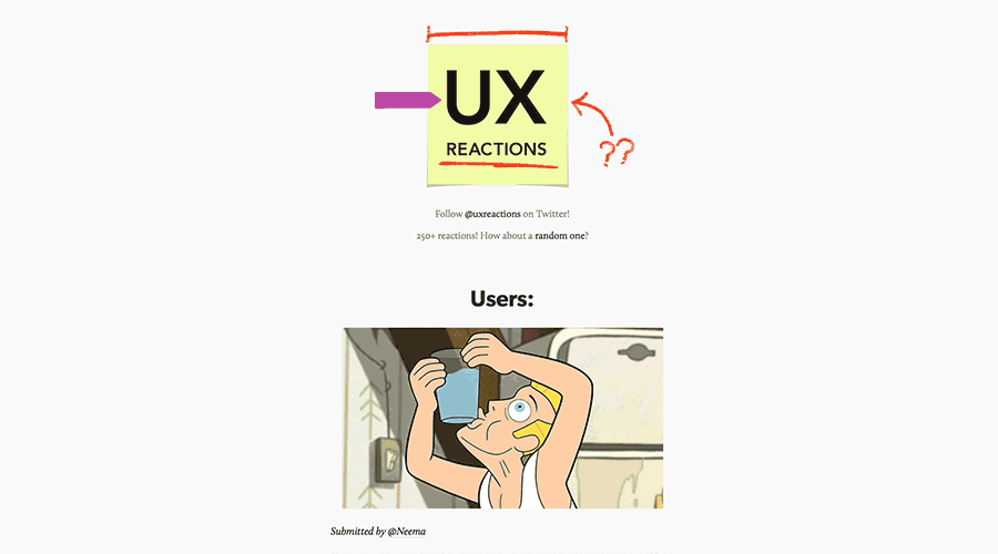 How right you are, hapless Gravity Falls gif. How right you are. UX Reactions / Gravity Falls, Disney
But, at least in theory, there are some design principles I know to stick to.
With a puzzle-based game, it’s harder to tell what’s bad UX: you don’t want the puzzles to be too easy to work out – they are the game, and if it’s not a little challenging, it’s not fun – but you also want every player to be able to solve every puzzle. There’s a balancing act to keep a game fun for everyone.
With Cuthbert, the difficulty of that balancing act has been notched up a level. Like, it’s being performed over a tank of hungry sharks. And also the person balancing on a tightrope is an elephant.
 Me, IRL. DollarPhotoClub
Because it’s a text-based browser game, the room descriptions are all written out in plain English at the top of the page, then all of the people and objects you can interact with in that room are listed underneath. The controls showing what you can do – look, talk, pick up, etc. – appear on hover in a beautiful radial menu design I hate myself for coming up with because it’s frustrating as all hell to code.
Regardless, it’s extremely clear what objects are in a room and what you can do with them. But that’s sort of the problem.
 Clean, simple UX. And horrible game design.
In a more traditional point-and-click game interface, half the puzzle would be finding interactive objects in a room, seeing something and coming up with a plan on how to use it. Reading a list of objects doesn’t give you quite the same sense of achievement as finding them.
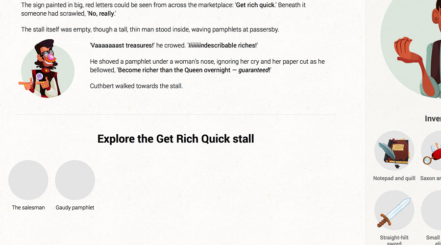
As a way to stop solutions to puzzles being glaringly obvious, I came up with the idea of putting in red herring objects into rooms early on. Some will fit the theme and push along the story, for example:
Other objects will be helpful, generic RPG objects like bandages which will always come in handy in general, if not in a specific puzzle. Others will only be useful for one specific puzzle – potentially even a puzzle you’re unable to see any more, depending on what choices you’ve made.
And that’s where I start getting worried about red herring objects. I’ve seen Sean Plott combine every item in his inventory when he’s stuck on Mostly Walking – it’s an age-old technique, and something I’ve done myself more than once out of sheer frustration. When you’re able to pick up a lot of items that might not ever be the solution to any puzzle and combine-everything-until-you-find-the-solution isn’t a feasible puzzle-cracking tactic, are you going against what the user expects of your game? Are you confusing them more?
Or is it worse to not have the challenge in the first place?
There’s an old joke that, if you let a UX expert design a game, you’d wind up with a big, red button which would display, ‘Congratulations! You’ve won!’ when you clicked it. Because UX is about simplification. Geddit? Geddit?
I’m trying to avoid that. But making sure it doesn’t go too far in the opposite direction is a whole other problem.
M. J. Magee
Don’t call me Ishmael. It would be wildy inaccurate. I’m a web developer writing my first online-point-and-click-game-cum-choose-your-own-adventure-book. Um, probably the first online-point-and-click-game-cum-choose-your-own-adventure-book. When not writing profiles about myself, I read, build websites, watch Netflix, and sleep. Lots.You may also like