There’s a saying about the best laid plans… Hmm, maybe I should have planned this post better and googled it.
L. Whyte and I decided at the beginning of this (overwhelmingly large) project that she’d create her (overwhelmingly beautiful) artwork in vectors and pass it on to me in a scalable vector graphic (SVG) format, which can be scaled up and down to fit any screen size or device without losing image quality.
Vector artwork is something that’s become increasingly useful with the advent of retina screens, which cram more pixels into a small space and make any image that isn’t as high-resolution as the screen is look blurry.
 Or, to use the technical term, awful.
Way back when (in 2012 or so), the way to deal with this was: a) not to, or b) to create a version of the image you wanted at twice the size you wanted it to be, using code to get it to the right size, so there were effectively twice as many pixels in the same space, making the image appear clearer.
But with browsers bringing on better support for SVGs, our founding front-end fathers soon found a better way: using a graphic made up of vector information instead of pixels.
Doing less work is never not useful, not having to create and maintain multiple versions of the same image is a lifesaver, and – since they’re raw data files, describing the co-ordinates that need to be drawn to make up the image – SVG files are much smaller and faster to download than other image files.
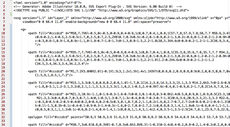 You don’t want to know what this is an image of.
Of course, being pedantic and abusively trained to respond to issues on Internet Explorer 6, I still like having a PNG fallback for older browsers, and use the vector graphics as a bit of progressive enhancement (wanky developer talk for ‘new is always better’) rather than the sole image. But that’s neither here nor there.
SVGs are awesome, and they’re what L. Whyte was passing her artwork to me in, splitting out the individual body parts into their own separate files so I could animate them or swap them out for different files whenever Cuthbert got a new piece of armour or a bloodied nose.
It seemed like a real time-saver.
It was not.
We soon realised the program L. was using to create the artwork, Xara, saved out the whole workspace instead of just the artwork when it made an SVG; the file wasn’t cropped to the size of the artwork, so it couldn’t easily be added to the code. Setting the width of a character’s head would involve a lot of trial and error and frantic math. Body parts wouldn’t line up because they weren’t in anything near proportion.
Progressive enhancement became a little less progressive and a lot less enhanced, is what I’m saying.
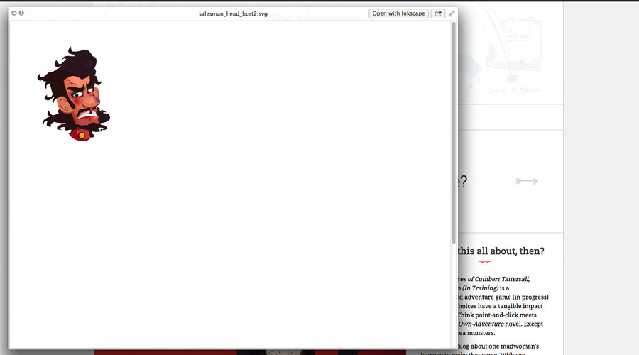 Not pictured: saved time.
Now, Xara is a Windows-only program (and L.’s version is all the way up in Scotland, with L.) so I couldn’t get a hold of it to play around with its export settings and see if I could figure out why it hated me and wanted me to fail. And I didn’t want to ask L. to do it because, in the time she manages to find between her full-time job, her volunteering work, her other freelance projects, and – so she claims – time not doing work to create art for Cuthbert, asking her to poke aimlessly at export settings is not the best use of her time.
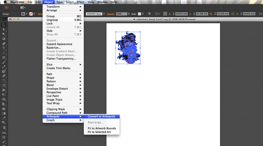
But, I thought, it wasn’t a problem. (How young and foolish I was then, three or four weeks ago.) I figured I could open the files in the program I have to edit artwork, Adobe Illustrator, crop the artboard area to be the size of the artwork, and save out the files again.
 Not pictured: saved time.
And that worked fine.
Except that Illustrator decided to helpfully tear out all of L.’s small, discreet details, like the bruises on a wounded character’s face. And some of the less small and discreet details, like the wings on a fairy.
It took a full, frantic hour, painstakingly playing with every possible export setting before I found a way to keep them in. As small static images, stretched across the vector.
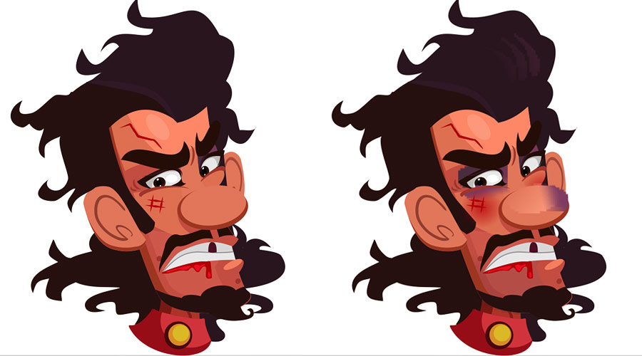 Not pictured: how this was actually meant to look.
It was starting to look like there was no way to get the artwork in as an SVG; I would either have to do mathematical gymnastics on each individual file – with each character being made of around four separate files as a base – or ask L. to send the artwork across as a different file format entirely, throw away all the work I’d done and code a whole new inferior, more time-consuming solution.
It like Sophie’s Choice if, instead of being subjected to the horrible whims of Nazi soldiers, Sophie had peeved off some graphic designers.
Which I suppose isn’t that similar to Sophie’s Choice now that I think about it.
That was a bad analogy. I do apologise.
But I was getting worried at this point. I even tried changing the SVG code directly which, when it’s as complicated as a beaten-up salesman (who doesn’t sell you anything) wearing a disguise or, say, anything more than a single black line, is not a good idea. Characters got some very interesting make-overs.
I was hunting across every design blog I could think of, scouring Stack Overflow for answers, frantically trying to find a way to get both the detail of the artwork and the right dimensions in the files, and angrily shaking my fist when the solution to everyone else’s problem was to happily have a blurry, static image stretched across their vector. Or not have gradient layers that would get transformed to blurry, static images, whatever.
I was banging my head against my keyboard in despair – and rather fortunately typo’d my way to salvation: Inkscape.
Inkscape is a free – free! – program for Mac and Windows (free!) which can crop artwork to the right size and export it with all its details. Free!
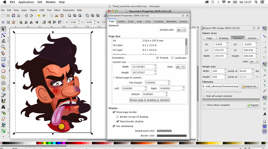 Never have I been more excited about a program performing its base functionality adequately.
The files it saves out are perfect. Even if it does mean running through a few more steps than the ideal of receive artwork, add to project. (The things I do for you, iPhone users…)
But, never mind. You know what they say about the best laid plans.
Er, what is it again?


