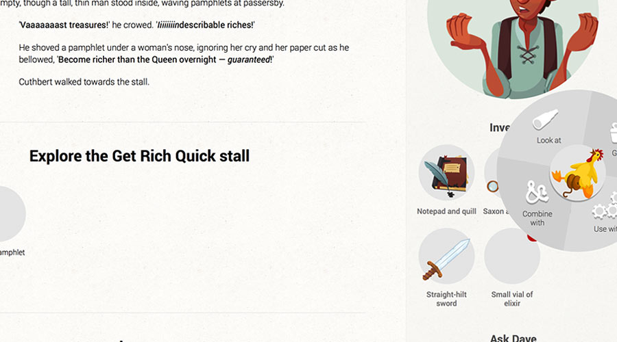
Aside from wanting to invest some money into Cuthbert so I’d have the motivation to finish it, even though Netflix has five seasons of Once Upon a Time waiting for me, wondering where I am, my biggest reason for wanting the inimitable L. Whyte to create artwork for the game is so it feels more like a game.
So much of the interface is in plain text but the interactivity, puzzle-solving, and story elements that change depending on your choices are pure video game, rooted in Lucasarts point-and-click adventures; I want Cuthbert to feel closer to that than to a Choose-Your-Own-Adventure book.
(I’ve taken a really wrong turn somewhere if it doesn’t. A Choose-Your-Own-Adventure book would be so much less work…)
To help make the game feel less text-heavy, I asked L. Whyte to create some (fabulous) icons for the different interactions you can have with characters and objects.

To keep the layout clean and undistracting, I put the icons in a radial menu that animates up when you hover on it. Which seemed like a great idea.

At first.
Oh look. There’s the drawing board again. Haven’t seen that in at least a week, now…


