


It’s Christmas and – as per the law – I have been overindulging in mince pies and underindulging in everything else.
The production of Cuthbert has slowed the past few weeks; my free time has been taken up visiting family and acting as a guinea pig for my five year old niece’s, erm, enthusiastic beautician work. (PETA, you’re welcome.)
But it hasn’t stopped. I’ve been pushing on with the UX for inventory menus inbetween mani-and-whole-entire-finger-cures and it’s starting to come together.
I spent some time trying different ways of presenting the inventory menu which didn’t involve half the options falling off the edge of the screen.
 Like this.
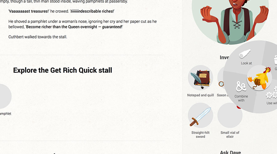
The most sensible way seemed to be leaving a much bigger margin and only having two inventory items per row – ’til you remember everything else in the sidebar will have to line up with the inventory and you think how annoying it’s going to be to scroll down and down to find what you’re looking for because there’s tons of unused space at the sides.
I tried launching the menus in modals that popped over the rest of the screen, but they felt intrusive and annoying, since they stopped you from interacting with the rest of the page; you wouldn’t be able to refer back to what had just happened and see what actions you could take with an item in your inventory at the same time.
Then I got lazy. I revisited what I already had.
 Like this.
Tell me it doesn’t solve the problem, though…
M. J. Magee
Don’t call me Ishmael. It would be wildy inaccurate. I’m a web developer writing my first online-point-and-click-game-cum-choose-your-own-adventure-book. Um, probably the first online-point-and-click-game-cum-choose-your-own-adventure-book. When not writing profiles about myself, I read, build websites, watch Netflix, and sleep. Lots.You may also like


